PROJECT DETAILS
PROJECT:
Tradeswift Signup Process
CREATIVE FIELDS:
Responsive Web Design, User Research, Wireframe, Prototyping
RESPONSIBILITIES:
Produced informational architecture, conducted usability studies, ideating, wireframing, prototyping and iterating design for a sign up process for a stock exchange app.
PROJECT DURATION:
6 weeks
TOOLS:
Figma, Miro, Adobe Illustrator, Pen & paper
Setting
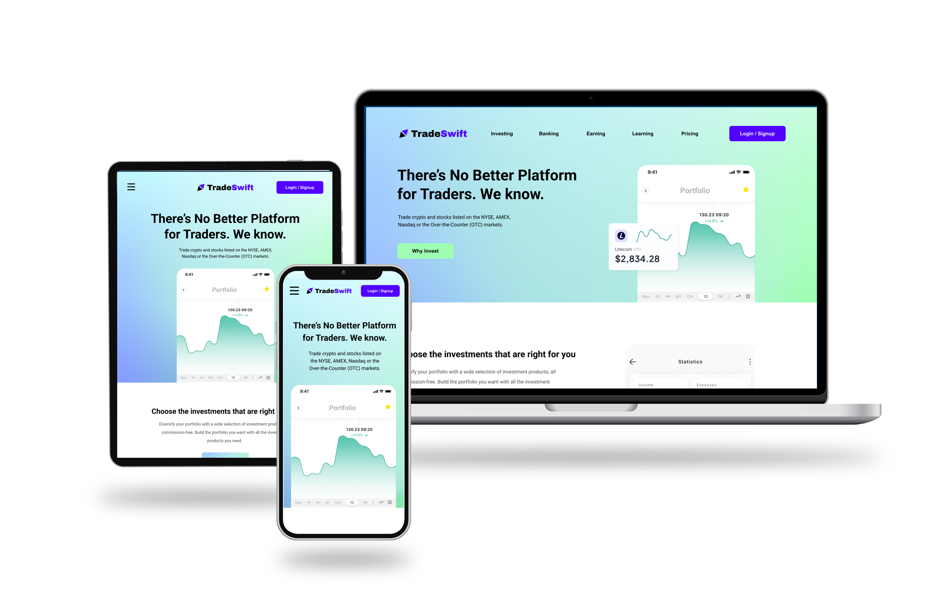
TradeSwift is a stock and crypto exchange app that features commission-free trading and real-time market data. The app targets well-seasoned and newly traders who want to have a clean designed app without any commission fees.
The Problem
There are a handful of stock and crypto exchange apps. However, not many have a robust clean process for signups. We want to create a form that is responsive across all devices so that users can sign up for the TradeSwift Stock Exchange app with ease.
The Goal
Our responsive form will let users sign up on the website regardless of their device to expand the user base and provide customers with a simple and straightforward form using a progressional order of questionnaires. We will measure effectiveness by monitoring the conversion rates on the website.
Understanding
COMPETITIVE ANALYSIS SUMMARY
I conducted a competitive analysis across a number of stock exchange apps including Robinhood, WeBull, SoFi and E-Trader. Upon my findings, there were a number of questions that seemed necessary for new users signing up for a stock exchange app. Using the data from my analysis, I used the information for the form needed for the signup page while parsing the overall process into individualized pages for ease user information consumption.
USER PAIN POINTS
- DESIGN: Certain forms don’t look clean or well designed, thus making some users hesitant for providing personal information.
- NON-RESPONSIVE: Sign-ups on certain sites are not very responsive and make it difficult for those browsing on other devices.
- NO PROGRESS INDICATOR: Long forms without a progress indicator make users feel lost or uncertain about how much info is required.
- ERORR MESSAGE: Unclear or messy field indicator makes it more prone for user error when typing in the text field.
User Journey Map
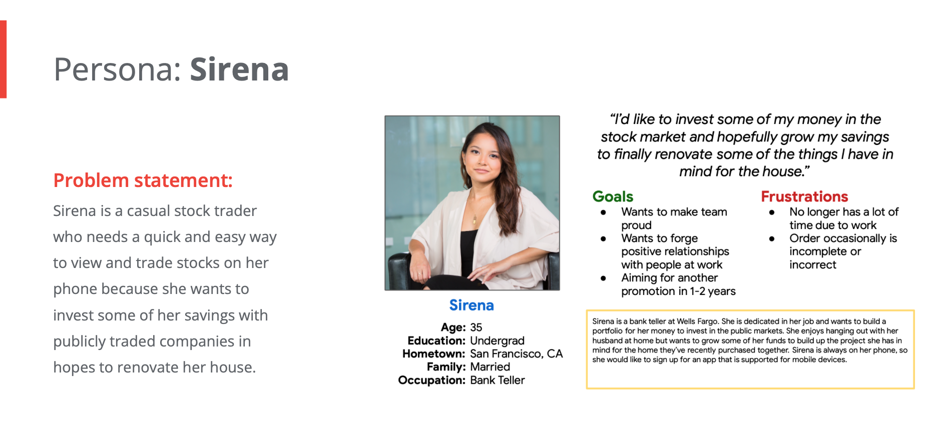
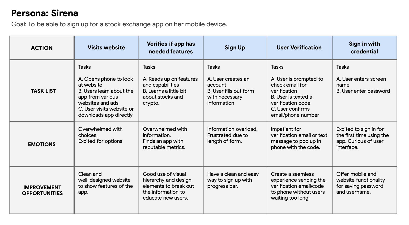
Mapping Sirena’s user journey revealed how helpful it would be to have progress bar on the form and a more digestible way to enter information.
DESIGN
PAPER WIREFRAME
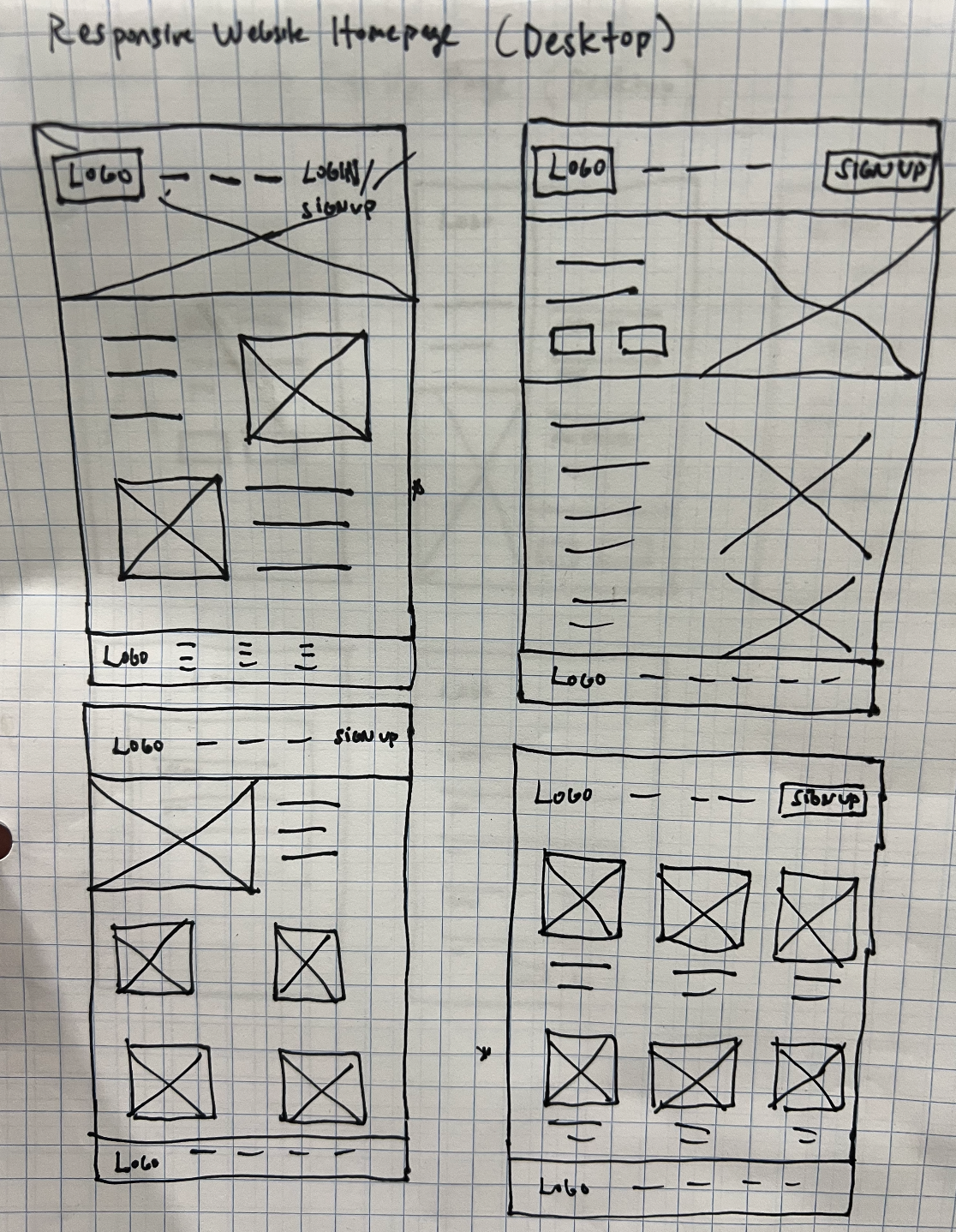
Drafting a number of wireframes of the sign up process on paper ensured that the user flow make sense before transferring content to digital wireframes. Based on the initial user study, there were key components we want to include to main a good user experience. For the home screen, I mocked up a webpage that resembles the app to help users get educated and to sign up for their service.
DIGITAL WIREFRAME
Form length have been reduced to paginations to reduce information overload and clutter. Example text are default within the text field to aid users from enter in the wrong field and incorrect formatting.
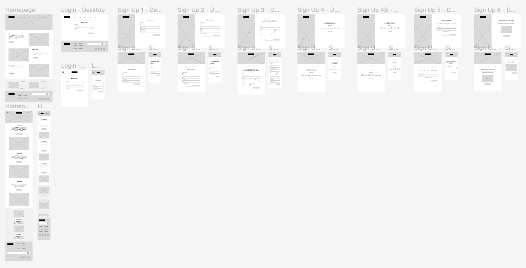
LOW FIDELITY PROTOTYPE
Using the completed set of digital wireframes, I created a low-fidelity prototype. The primary user flow I connected was creating an account, and following through the form to sign up for the product.
USABILITY STUDY #2
I conducted two rounds of usability studies. Results from the first study helped refined the flow and designs from wireframes to mockups. The second study used a high-fidelity prototype and revealed a need for color adjustment and padding for legibility issues.
Round 1 findings:
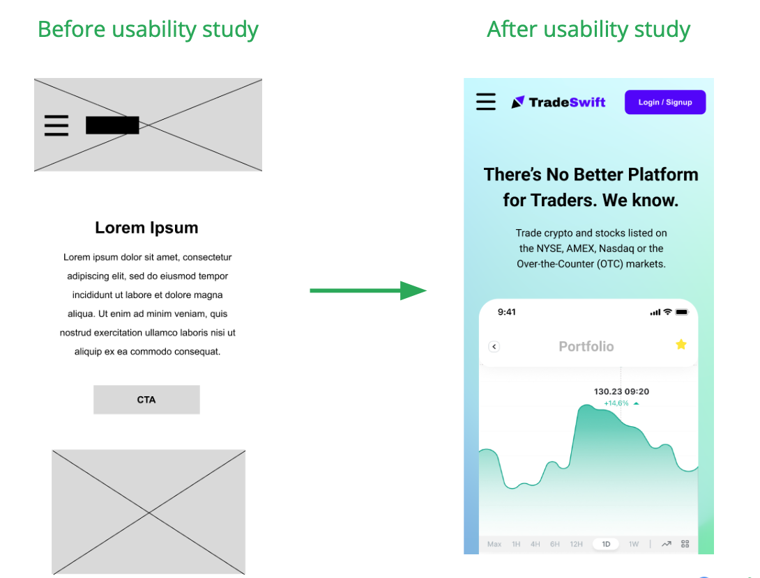
- Users want login button visible on mobile; outside hamburger menu.
- Users would like example text in the text field to prompt users to enter correct info.
- Users like progress bar to determine how long form is.
Round 2 findings:
- Visual design adjustments for font sizing a color for legibility.
- Increase negative space and include a back button on the form.
REFINING THE DESIGN
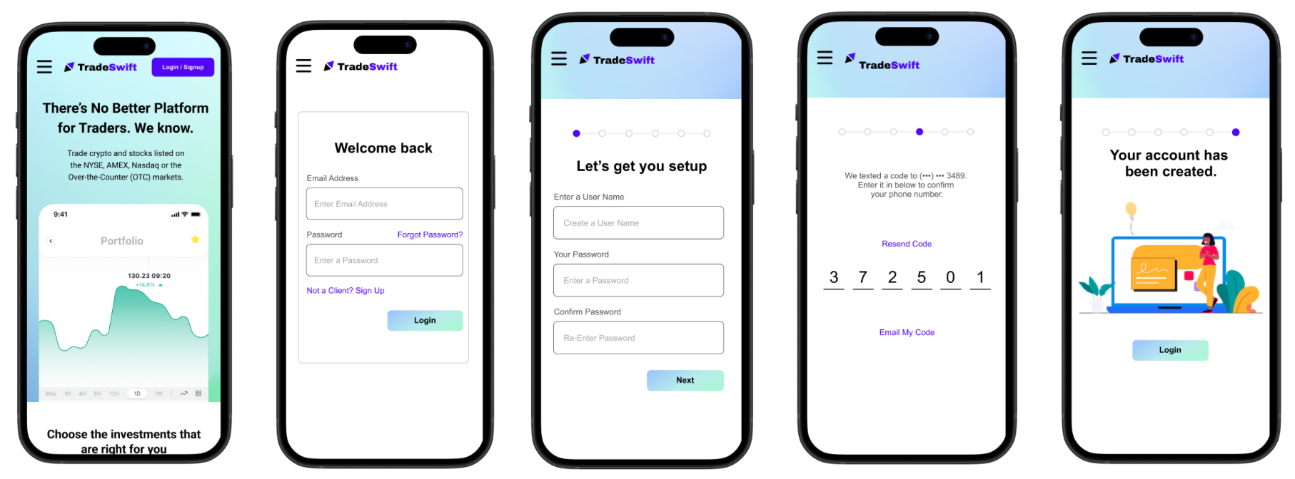
MOCKUP
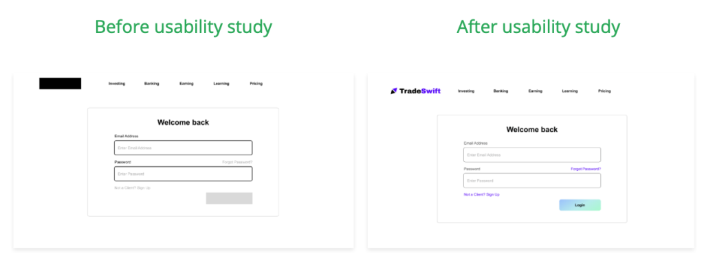
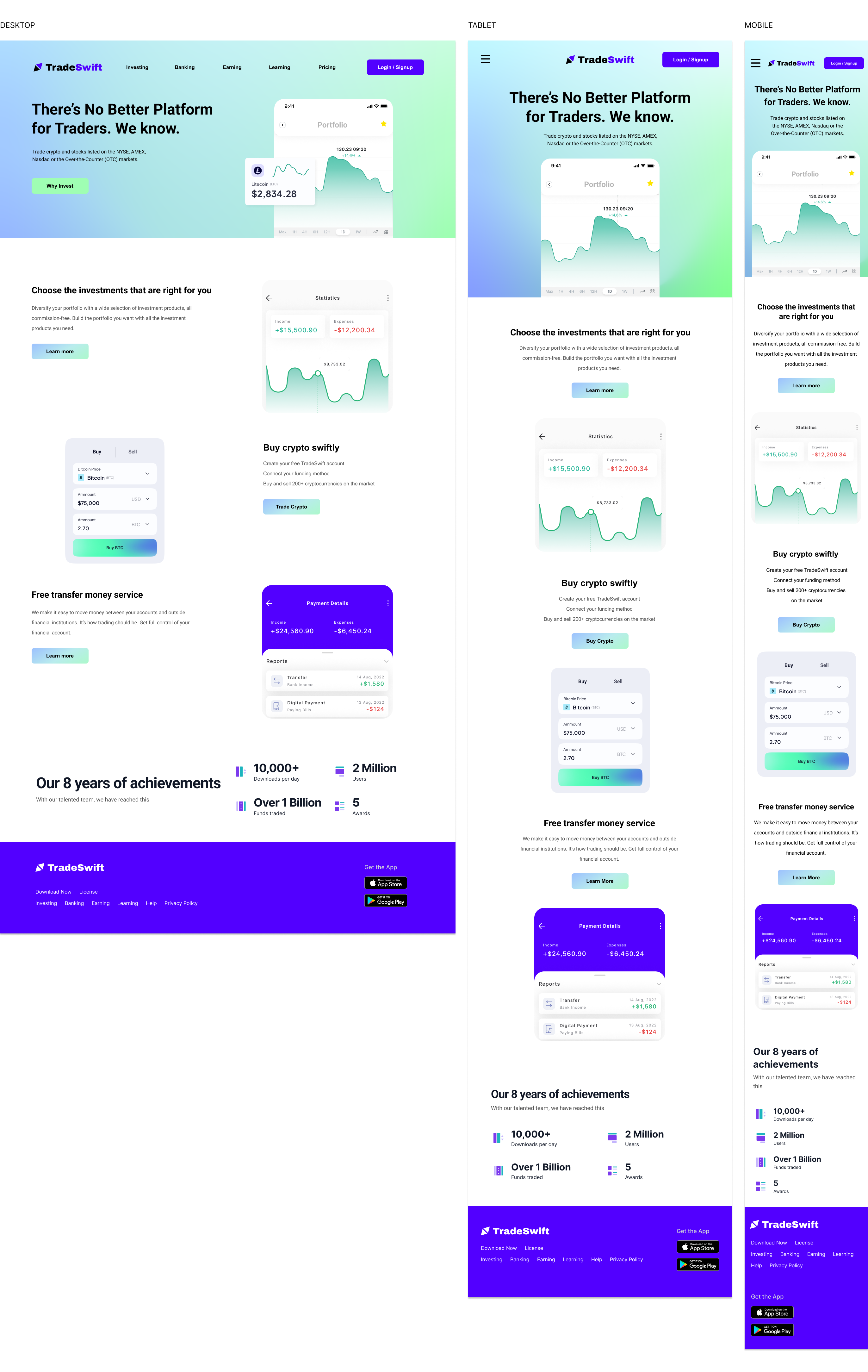
Early designs prompted login page instantly. After the usability study, designs were revised to add emphasis and color to the signup link along with subtle animations that helped appear like you’re progressing towards the finish line.
The second usability study revealed on the homepage that folks took a little long to find the Login/Sign up CTA even though it was featured in the hamburger menu. In the 2nd iteration, we’ve decided to move the button out to be visible above the fold.
ACCESSIBILITY CONSIDERATIONS
- Provided access to users who are vision impaired through adding alt text to images and increasing font size of form.
- Used visual hierarchy and text examples in text field to prompt users to input values in correct field.
- Ensured colors and contrast passes WCAG standards for those visually impaired.
TAKEAWAYS
IMPACT
The sign up process appears simple, and feasible. Sign up looks professional which makes submitting personal information appear much more secured and tangible. Creating a fluid design for various screen sizes also opens up more opportunity for conversion with a growing audience now browsing on mobile devices.
Simple and well-designed sign up form. It didn’t look overwhelming like some form submissions I’ve seen which quite often looks so overwhelming to fill out!
WHAT I LEARNED
While designing the TradeSwift sign up process, I learned that you can discover a lot of functional add-ons that weren’t considered prior to conducting the research. Conducting usability studies and peer feedback really improved the design and features of the app. While it took some time, it was well worth it.
MOVING FORWARD
- Conduct another round of usability studies to validate whether the pain points users experienced have been effectively addressed.
- Conduct more user research with an even wider range of diversity to determine any new areas of needs.
- Conduct a qualitative research to determine if app would be recommended to others.
