PROJECT DETAILS
PROJECT:
211 Bay Area United App + Web
CREATIVE FIELDS:
UX Design, Web Design, User Research, Wireframe, Prototyping
RESPONSIBILITIES:
End-to-end design process from understanding to testing of app and responsive website. Conducted user research, ideating, wireframing, prototyping and iterating designs.
PROJECT DURATION:
10 weeks
TOOLS:
Figma, Adobe Photoshop, Adobe Illustrator, Pen & paper
Setting
211 is a free service providing access to local community human services. The 211 services different counties across the United States. This can range from financial assistance, food banks, to mental health assistance. The service connects over 37,000 Bay Area callers each year with information about health and human services available to them.
The Problem
Utilizing Google to search for human services can be a daunting experience when agencies do not optimize their search rankings, especially when you’re uncertain about an agency’s availability in your community. The visibility of websites in search results heavily relies on keywords and search engine optimization (SEO). However, many non-profit organizations often lack the essential SEO tools and marketing resources to ensure that users can easily find the services they need. Clients seeking these services want:
1) A reliable search results with updated information based on programs
2) A way to text with a professional case managers for guidance
3) A way to dictate their searches in their own language
4) Have a page of bookmarks for services they would like to compare
The Goal
Similar to the free telephone service, 2-1-1 offers an avenue for users to search and engage with a dedicated assistant in order to locate human services within their local community. The development of this app and the responsive website offers a less intrusive and more user-friendly method for searching and researching these vital human services.
Understanding
USER RESEARCH SUMMARY
Prior to commencing this project, I conducted a comprehensive competitive analysis of various 2-1-1 websites, identifying the core functionalities that users found particularly beneficial. After collecting and synthesizing the data, I transformed my observations into valuable insights, revealing that the majority of users fall within the age bracket of 20 to 55 and are already adept at accessing the internet via their mobile devices. My research further confirmed that more than 55% of these users prefer to independently conduct research to determine the best options for their specific needs.
USER PAIN POINTS
- INACCURACY: Some agencies listed on Google do not serve in their community or have outdated information for the user.
- LACK OF FUNCTIONALITY: Current 2-1-1 Bay Area website does not support notifications and a way to organize their findings.
- NO NOTIFICATION: No live updates or notification system regarding new programs or local community events.
- LESS INVASIVE: Many users have voiced they prefer texting vs. speaking with someone over the phone regarding human services, especially for those more introverted.
User Journey Map
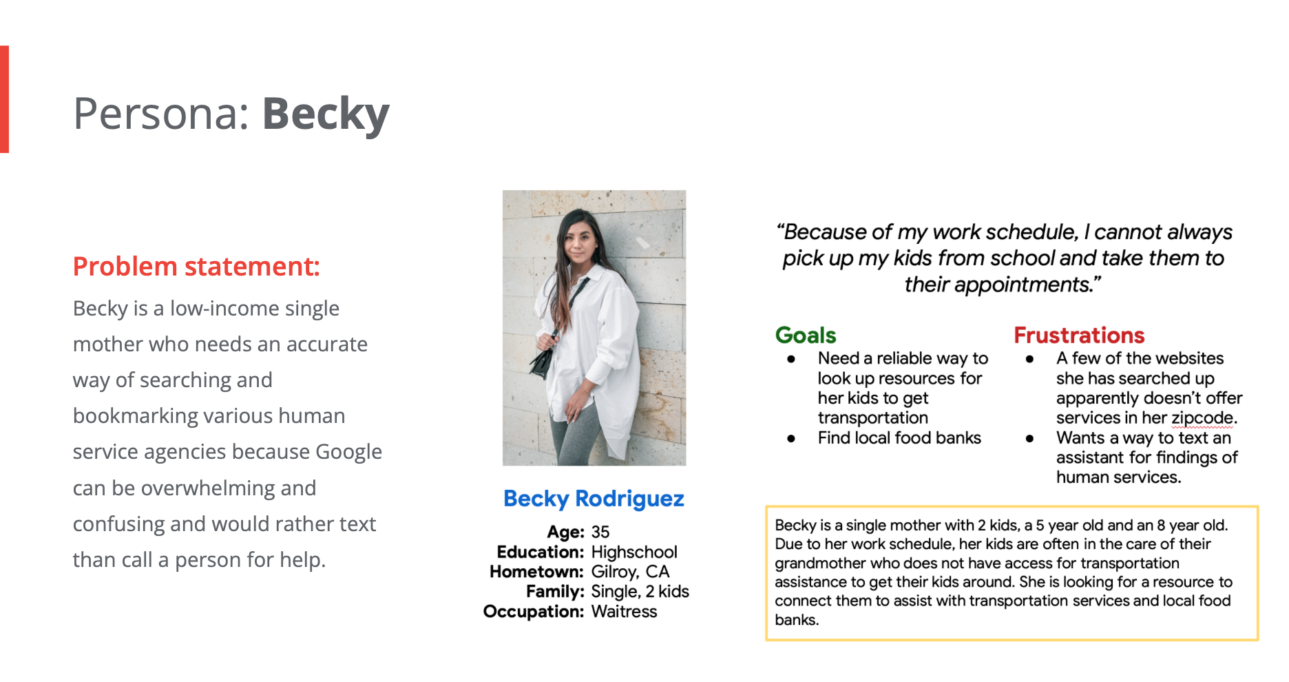
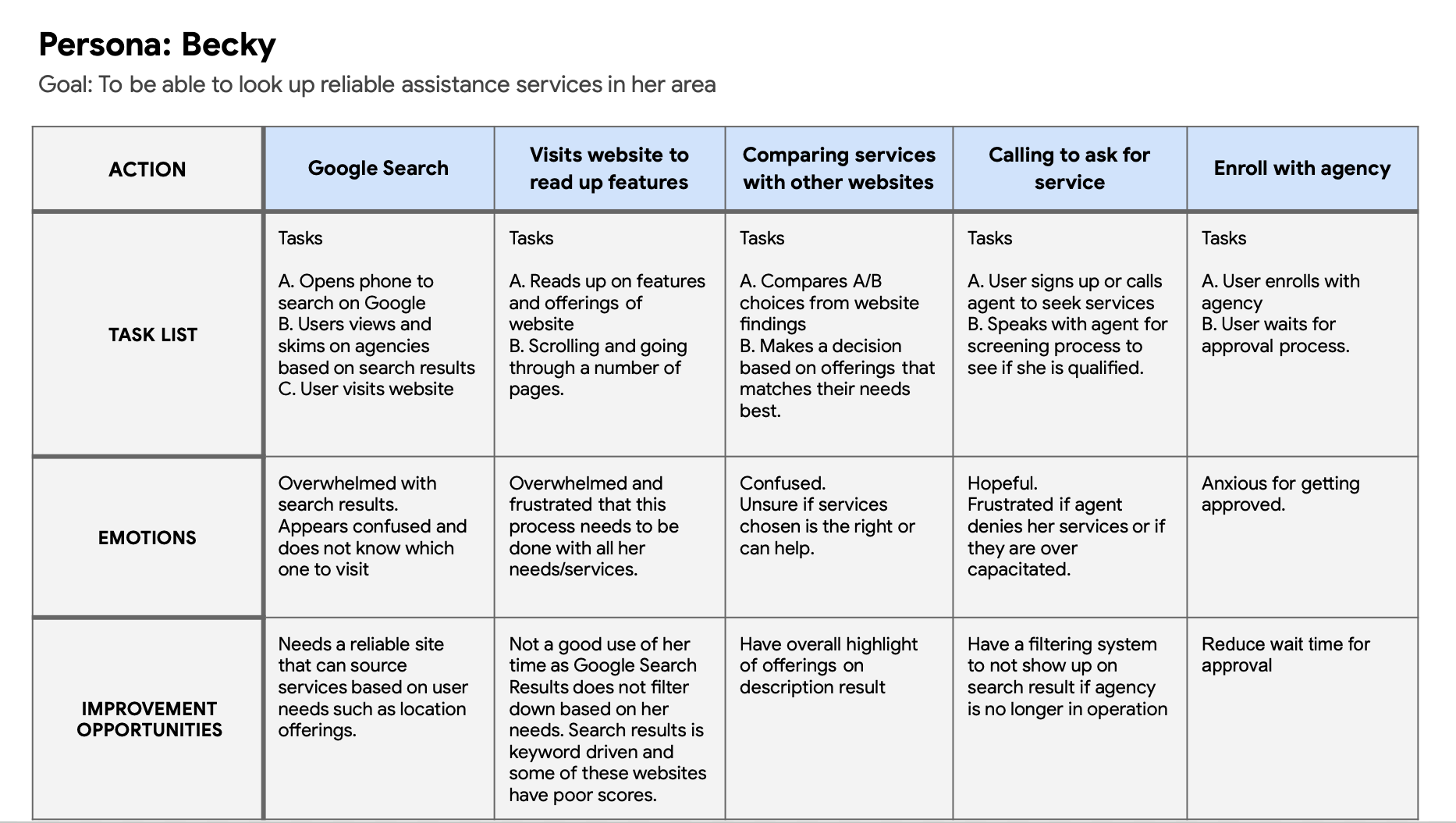
Mapping Becky’s user journey revealed how helpful it would be if her search results is catered to accurate findings that serve in her community and how long an agency typically responds.
DESIGN
INFORMATION ARCHITECT
Laying out how the site will be organized ensures that all the pertinent info are placed on pages that make the most sense to the users to navigate to.

PAPER WIREFRAME
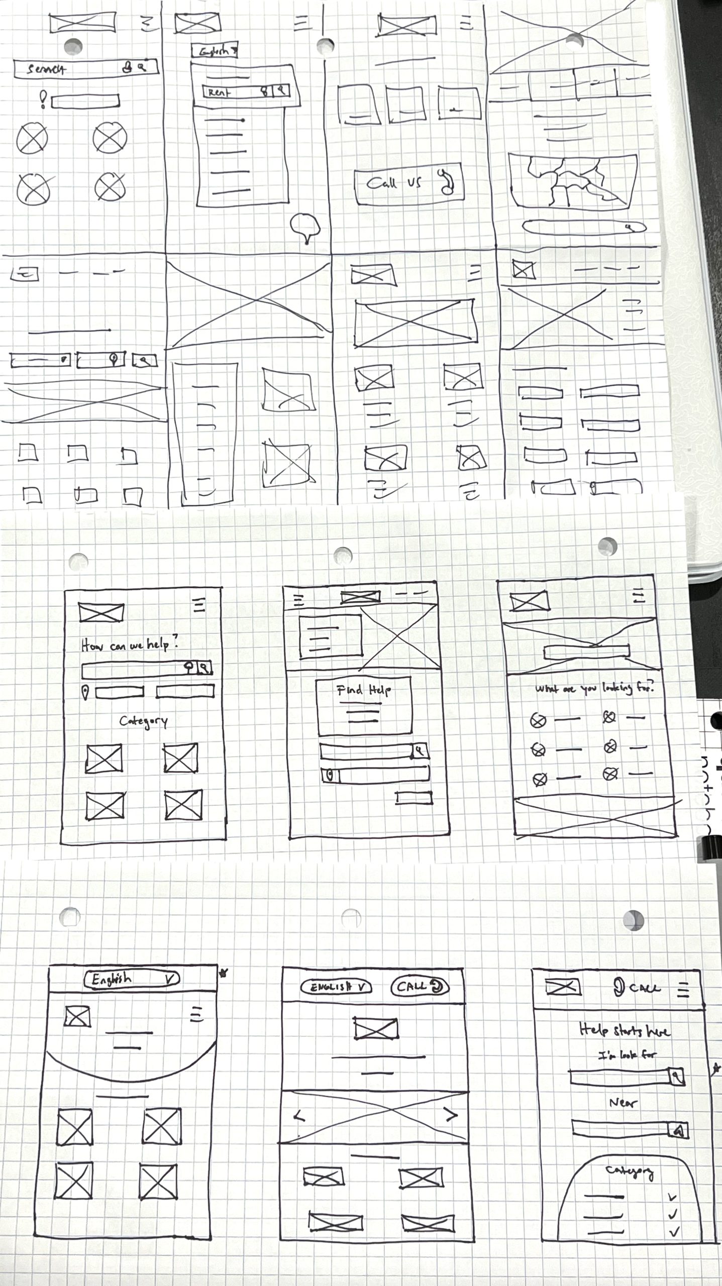
Investing time in sketching multiple iterations of each app screen on paper was a deliberate effort to ensure that the user flow and elements carried over to the digital wireframes were meticulously designed to cater to the core functions of the app. In the case of the home screen, I created mockup layouts with a primary focus on the search bar, aiming to efficiently guide users to the search results page.
DIGITAL WIREFRAME
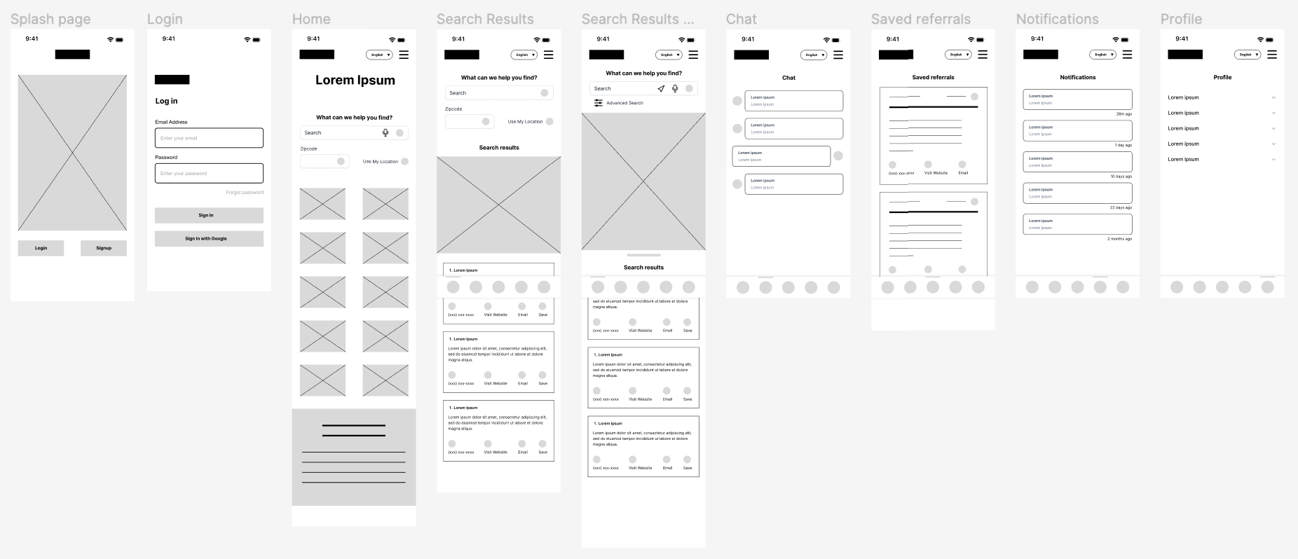
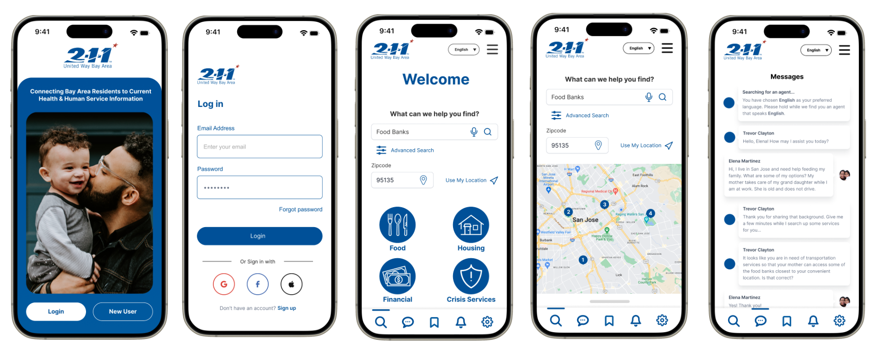
As we continue to refine our wireframes through iterative design, I have remained committed to shaping screen layouts in response to valuable feedback and insights gleaned from our research. For instance, following the findings from usability study #1, we introduced prominent icons and a voice recognition feature for search.
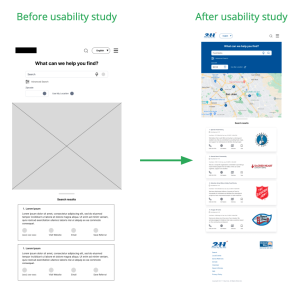
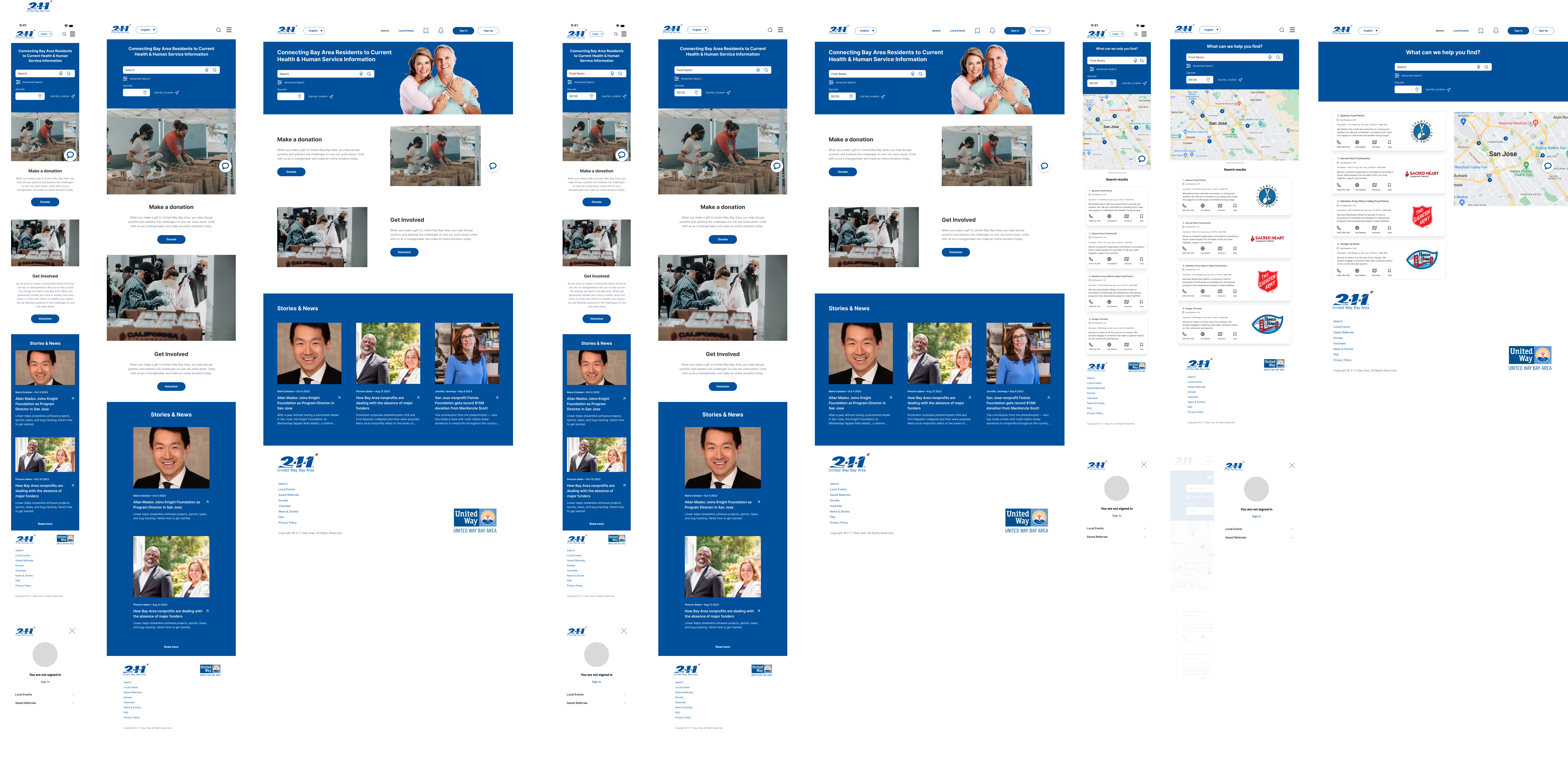
Before the initial usability study, it was evident that the map area on the screen was too restricted. Consequently, we expanded the map area, and in a subsequent update, we incorporated a convenient search results tab that slides up as users scroll down to review the search listings.
LOW FIDELITY PROTOTYPE
Using the completed set of digital wireframes, I created a low-fidelity prototype to ensure the user flow worked as intended. The primary user flow I connected was logging in and flipping through the nav screens in the app.
USABILITY STUDY: FINDINGS
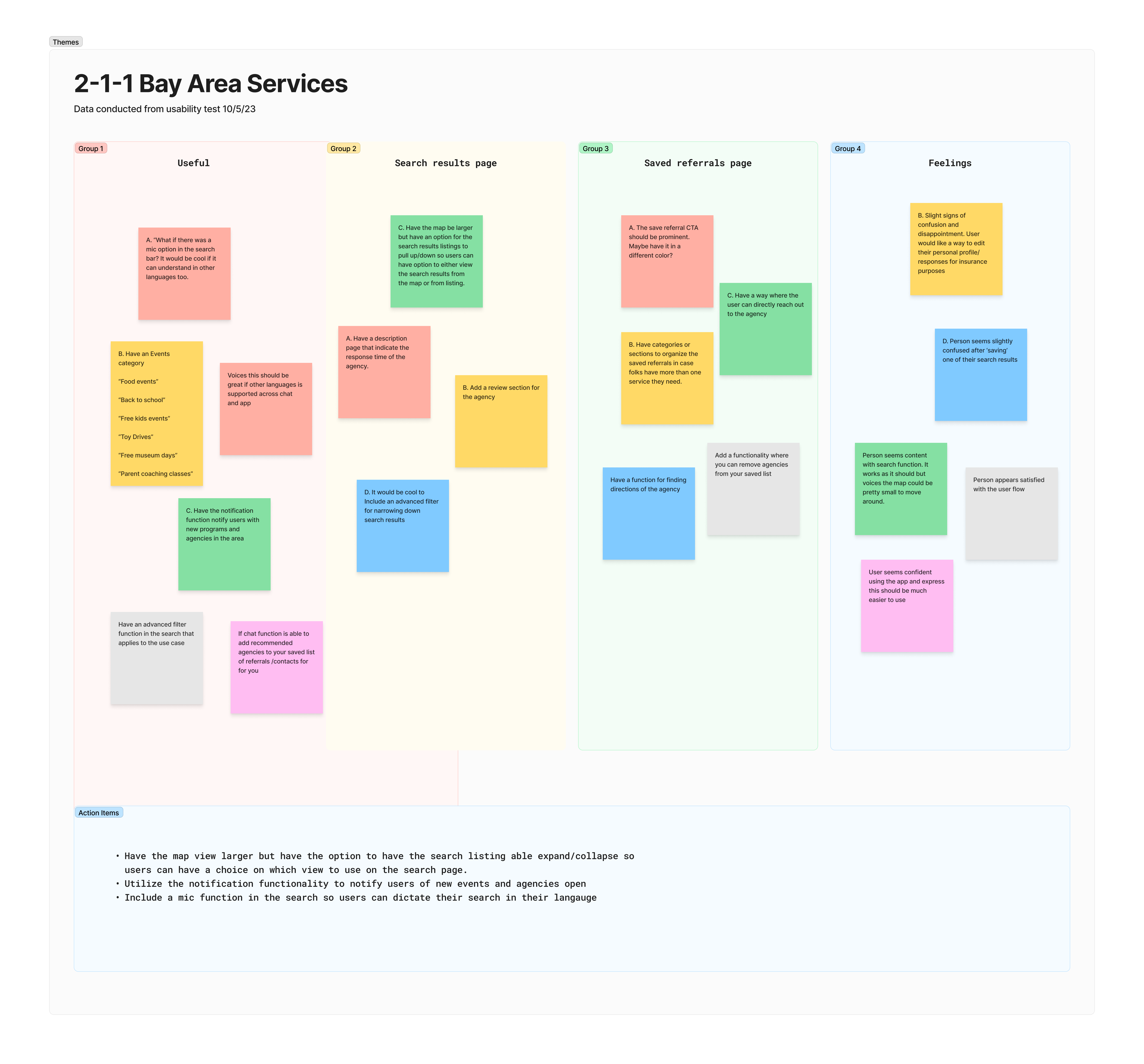
I conducted two rounds of usability studies, with the results of the first study serving as a valuable guide in refining the flow and designs, transitioning from wireframes to mockups. In the second study, we employed a high-fidelity prototype, which unveiled a requirement for adjustments in color and padding to address issues related to legibility.
ROUND 1 FINDINGS:
- Users want a mic to dictate searches in their own language
- Add prominent icons and text for the categories below the search for legibility and compatibility with screen readers.
ROUND 2 FINDINGS:
- Have chat available in other languages. Not just the web/app.
- Further visual design edits such as padding and contrast.
REFINING THE DESIGN
MOCKUP
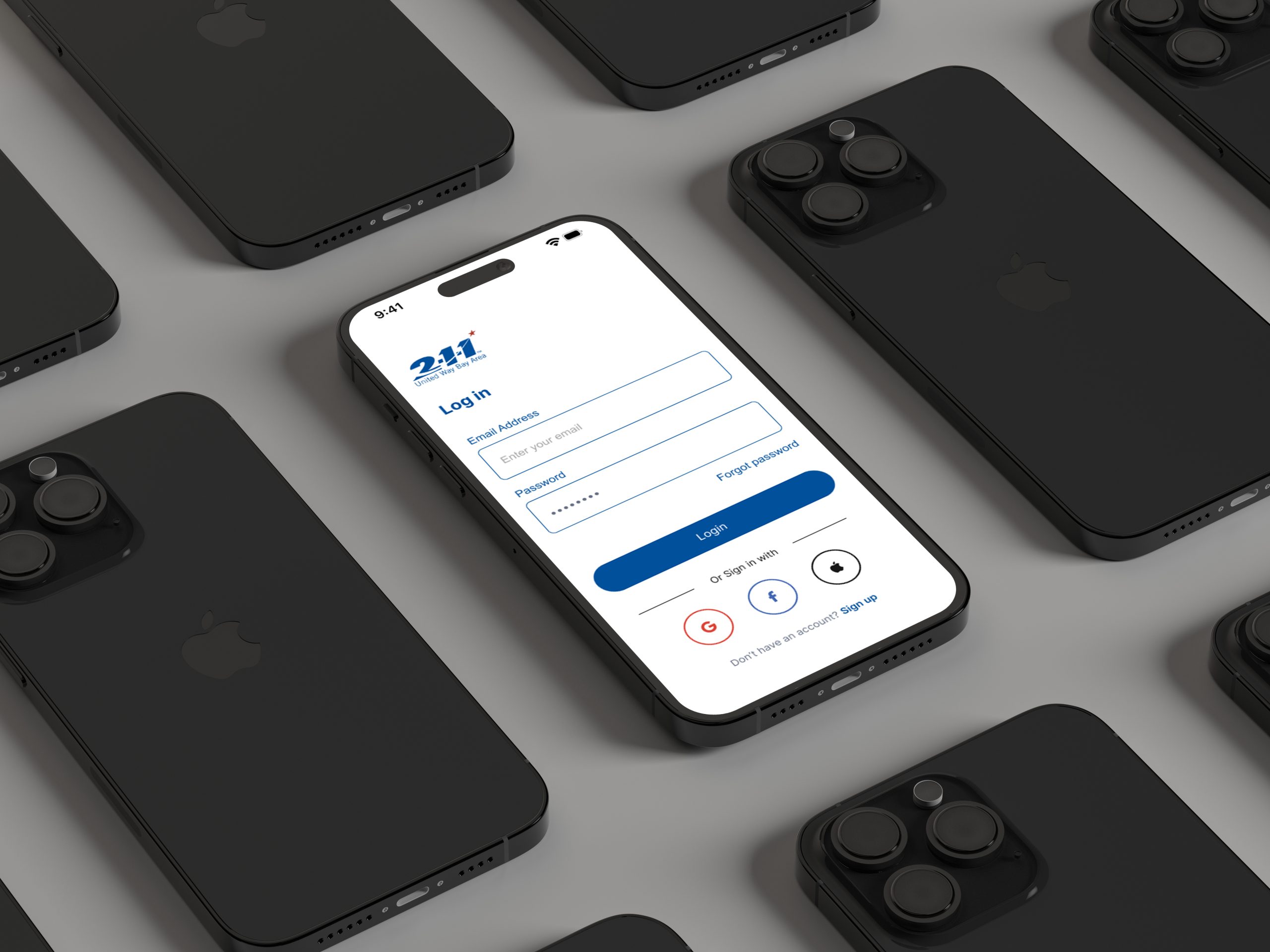
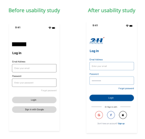
In the initial design, users were immediately prompted with a login page upon opening the app. However, following the usability study, we made significant revisions to provide additional sign-in options for a more convenient experience. Additionally, we incorporated a sign-up link directly on the login screen, eliminating the need for users to return to the splash screen to access this option.
The findings from our second usability study highlighted that the larger screen layout for the search results page offered ample space for each card. As a result, we incorporated the agency logo, ensuring their brand is prominently displayed, making it easier for users to recognize and identify them.
ACCESSIBILITY CONSIDERATIONS
- Increased icon size and added alt image tags for screen reader compatibility.
- Used visual hierarchy and text examples in text field to prompt users to input values in correct field.
- Ensured colors and contrast passes WCAG standards for those visually impaired.
TAKEAWAYS
IMPACT
The chat function and notification feature proved instrumental in educating and informing users about local community events. Moreover, the app served as a dependable resource for non-profit organizations.
This is exactly what I needed! I was frustrated by the overwhelming information on Google and just needed a little guidance to ensure the agency I’m researching for is going to be able to serve me.
WHAT I LEARNED
The non-profit sector is ripe for substantial improvement. I have personally encountered numerous frustrations and pain points, both from the client and agency perspectives, which underscore the urgency for enhancing the overall design and processes. The findings from the usability studies conducted for this project have clearly demonstrated that improving the design and functionality of apps can have a profound impact on users.
WHAT’S NEXT?
- Conduct another round of usability studies to validate whether the pain points users experienced have been effectively addressed.
- Conduct more user research with an even wider range of diversity to determine any new areas of needs.
- Conduct a qualitative research to determine if app would be recommended to others.
Want to connect to learn more? Please feel free to drop me an email.
